 The Big Ten Conference announced its new logo on Monday. Fan response has been almost universally negative. Commissioner Delany says, “Any time you have something new … it takes some time to get used to.” That’s true enough, but so far the best that can be said about the logo’s reception is that people seem to dislike it less strongly than they do the new division names (“Leaders” and “Legends”) for football.
I don’t know how long the retiring logo, with its iconic “11” in the negative space, took to get used to after its introduction in 1990, but it qualifies as beloved now. It was designed by Al Grivetti, who also provided designs incorporating 12, 13 and 14 in case the league decided expand beyond Penn State. I’m curious about these designs and would love to see them.
The new logo was created by Michael Bierut and Michael Gericke of design firm Pentagram. Delany says that “pretty much everybody in the design world” advised against a 12 in the negative space of the new logo, and evidently Bierut and Gericke concurred. “Its contemporary collegiate lettering includes an embedded numeral ‘10’ in the word ‘Big,’ which allows fans to see ‘Big’ and ‘10’ in a single word.” They say the new logo is memorable and distinctive. Critics say it looks like a 2-year-old put it together, would be forgettable if it weren’t so ugly, is the dumbest thing I’ve ever seen, and rivals Gap as worst logo change ever.
I seriously can’t find anybody on the net who claims to like it, though some are ambivalent. I guess I would have to put myself in the ambivalent camp. I was hoping for better. It’s not attractive or clever or even memorable, but it is serviceable.
specific thoughts:
-
The letters I and G are supposed to look like the digits 1 and 0. The I definitely looks like a 1, albeit in a somewhat jarringly, but I don’t think the G looks much like a 0. Some think the G looks more like a 6. “Not at all,” says Delany, “we were thinking 10, not 16.”
-
This shade of baby-blue is a color which none the twelve member schools claim. Perhaps that was a goal. I find it unpleasant, but I can’t put my finger on exactly why.
-
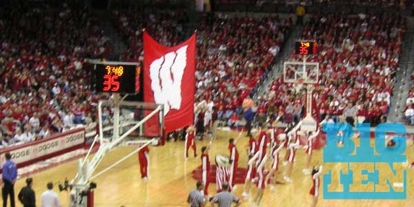
I do think the logo will work quite well as a “bug” on TV. Check out these (poorly) simulated screenshots for the league’s top two revenue sports and see what you think. Perhaps this was also a goal, but I doubt it because broadcasts will be branded by the Big Ten Network (or ESPN, etc.) and not by the conference itself.

